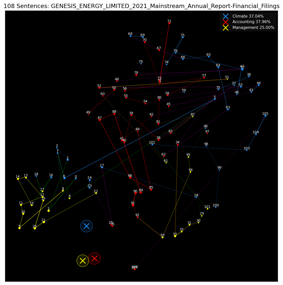
As AI & ML architectures become increasingly complex, I believe data visualization will serve as a crucial bridge between human understanding and machine intelligence. Visual tools enable us to interpret model behavior, uncover patterns, and build trust by making opaque systems more transparent and explainable. The visuals I create during my research process often uncover hidden insights that would be difficult to detect through raw data alone. These visualizations have directly led to meaningful improvements in model performance and understanding like in the example below with .
R2-PCA Model Comparison Animation
Visualizations can uncover insights into how models perform that raw metrics often miss. Below is a comparison between R2-PCA, standard PCA, and an industry model, I-PCA. The key to visualizing high-dimensional models is designing simple, low-dimensional tests—an approach that works for both supervised and unsupervised models like PCA.
Because PCA is computed on a covariance matrix, I created a simple “cross”-shaped dataset that can be rotated using a projection matrix to simulate market movement. By increasing the rotation angle (θ), we can test whether models lose track of the data they are trying to represent. This test revealed that even small rotations can cause I-PCA to fail to converge. Standard PCA tracks the data correctly but suffers from eigenvector flipping, while only R2-PCA maintains stable eigenvectors throughout. An interesting detail emerged when visualizing I-PCA’s eigenvectors—they extended slightly beyond the bounds of the unit circle. Upon investigation, this proved to be a stretching bug in the publicly available pip library. This example illustrates how visualization and simple test frameworks can isolate subtle but critical issues in complex, high-dimensional models.
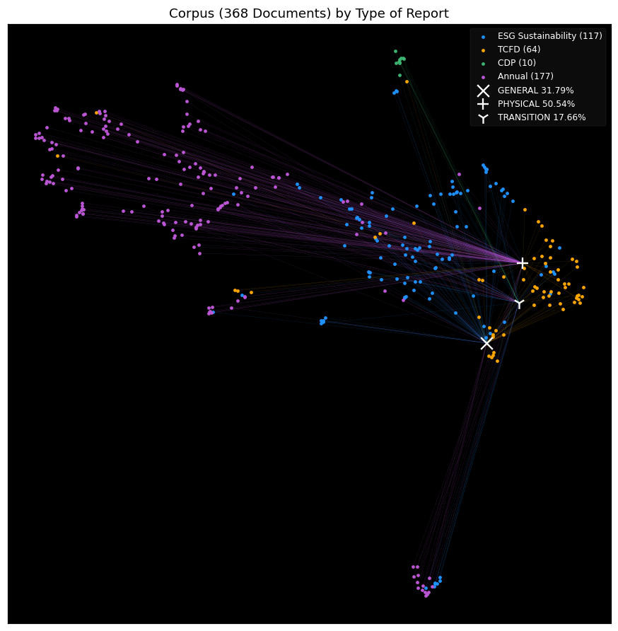
I believe that visual representations are essential for interpreting, communicating, and extending the power of language models. High-dimensional language data can be abstract and opaque—visuals bring clarity. From attention maps and embeddings to clustering patterns and model behaviors over time, well-designed visuals allow us to spot patterns, diagnose model failures, and communicate complex findings to technical and non-technical audiences alike. The two visuals below depicts sentences/documents visualized in lower dimensions using t-SNE as part of the R2-T2C paper.
TSNE Absolute Comparison (R2-T2C)
TSNE Relative Comparison (R2-T2C)